Creating type is an extremely difficult and skilled discipline and designers deserve to be compensated fairly. However Monotype’s business practices are such that I won’t approve anything but open source fonts for new projects.
But as I wrote here https://news.ycombinator.com/item?id=45973261#45977078 Besides open source fonts there still are stable high quality independent foundries that are safe to use as they would already be bought. (from comment above “Mostly swiss/european companies likes of Grilli type, Lineto, Dinamo, Klim type, Florian Karsten, Swiss typefaces… companies with often just few employees.”)
Buy a great company, suck as much cash as they can before discarding the empty carcass.
The fact that the cost of using gray area to hide and move money to not pay taxes has a predictable and slow movement is the best for those players.
https://www.thedailyupside.com/advisor/investing-strategies/...
owned lock and stock by billionaires
Arguably they shouldn't be allowed to exist: They use what seem to be loopholes in corporate law to run what are essentially embezzlement schemes. If a lone person runs an embezzlement scheme, that's possibly a felony charge. It shouldn't be a loophole that a company can do it just fine without repercussions when we know a lone individual doing it is a crime.
The two problems in why they are allowed to exist are enforcement and probably legislation. Legislation is needed to close any actual loopholes in the law and/or just explicitly say things like "Leveraged Buy Outs are illegal". Enforcement is getting courts to see this as a crime and prosecute it as such. They may be waiting for legislation before they feel confident enforcing it.
Fixing those problems is certainly easier said than done.
(ETA: Also some of this is classic Anti-Trust violations. Trusts/Monopolies are still illegal. Enforcement has been somewhat negligent in the US this century and some of these deals cross too many country borders making enforcement in general harder. In this specific case, a US private equity firm buying a Japanese company, who enforces the anti-trust issue, especially if the Japanese company was already a de facto local monopoly before joining the international one?)
In principle, private equity firms could be a net positive: they could take over a business that's failing or just not living up to its potential, and turn around the management of it to improve it for all concerned. They often market themselves on this concept. In practice it rarely seems to work this way, where either they fail to make any return on their investment or they basically do this kind of monopolising, short-term extortion of customers. Often both.
(Patrick Boyle has a video on them from the financial side if you want some details: https://www.youtube.com/watch?v=bfUOPDOLHvE TLDW: they often aren't a great deal for investors, either)
Will never give Monotype and the like another penny.
Also there is very high chance they already got offer from HGGC and simply refused it, because some similar notably independent type foundries got bought recently.
Its similar to how some people say leading to mean line height. Lead strips were used for space between lines of text.
I think it’s more likely that vulture capitalists have discovered a matket that they can ruthlessly exploit, extracting every last shred of value without giving the slightest of shits about its long term sustainability.
I saw multiple font discussions today. These are just variations on letters, there was some interesting stuff in the past but it’s over now. There should be no ip left, just remove all protections. The world won’t be worse off.
That's still a lot of fonts, but it's not 2000. I guess designing a font for a language with 2100 different characters is probably a hassle.
The ~2000 is the official count taught in schools, but the actually "commonly" used number in literature is around ~3000. And you actually want more than that, because people's names can use weird kanji which are used nowhere else.
On the other hand, the vast majority of kanji are actually composed of a limited set of "subcharacters". For example, picking a completely random one:
徧 ⿰彳扁
So this actually makes creating a CJK font somewhat easier, because you can do it semi-algorithmically. You don't have to manually draw however many thousand characters there are, but you draw those "subcharacters" and then compose them together.
But I'm pretty sure they're not actually redrawing every character from scratch, and are actually reusing the subcomponents (at very least for normal fonts). But how much of that is actually automated - you'd have to ask actual font designers.
With all due respect, this is the type of comment that really makes online discourse so exhausting.
Yes, I know! Unless you put up two pages of disclaimers and footnotes there's always someone who comes out of the woodwork and "um ackshually"ies you. It was only supposed to be a quick and dirty comment talking about the topic in general, and not an in-depth, ten page treatise on the subject.
If you have something to add to what I wrote, then please do so, but heckling random people who put up their comment up in good faith is not helping anyone.
Pretty much every native university student I met when I studied there, had passed the Kanji Kentei level 1 test. A certification of proficiency in around 6000 kanji.
> Japanese primary and secondary school students are required to learn 2,136 jōyō kanji as of 2010.[4] The total number of kanji is well over 50,000, though this includes tens of thousands of characters only present in historical writings and never used in modern Japanese.
Motoya is also a reputable foundry. FONTDASU also, I guess. And Google's Zen.
But those are all text faces! The only display families are a few freebies from Fontworks which do not cover a lot of design range.
So, yes, hardly 2000.
I'm normally the last person to defend up, but there's some interesting stuff going on with svg fonts. I'm pretty sure there's only one or two true monoline fonts for instance.
Also high quality ligature support is still not that common.
They started questioning us and assumed we had pirated the font. Send them the old receipt and told them politely to fuck off.
Never heard of them again luckily.
Marketing got very nervous though and wouldn't calm down, so I sent the receipt.
It turned out we had got licences, but not for anywhere near the billions of pageviews we were putting through.
We quickly switched the fonts to open source analogues and got the legal team involved. The final bill was much less than their opening bid but still a lot. It would have been much more expensive if we hadn’t had the resources to negotiate.
Sure, if you need a custom font, you can pay someone to create it.
Once it exists, the creator has already been compensated fairly.
While it's possible to commission a custom font and many companies do eg. Apple, IBM, Airbnb, Bytedance, Vercel, Github, Mozilla etc. Some even make them open source. However it's not really a viable option for anyone other than the largest organisations as it's far more expensive and time-consuming than just getting a licence unless your scale is such that a commission would be cheaper.
Nothing wild about it. That's simply the reality of intellectual work. Only the first copy need ever be paid for. That is the true cost of creation. The cost of all subsequent copies is approximately $0 with 21st century computer technology.
All intellectual work is information. All information is bits. All sequences of bits are numbers. All numbers already exist in the abstract world of mathematics. We merely find them. A 20 kiB picture is just a number with 49,321 decimal digits. Creating that picture is just a process that somehow finds the right digits.
We humans are merely interesting number generators. We are anti-RNGs. Once the number has been generated, copying it is trivial.
Intellectual property exists to establish artificial scarcity. It's not real, it's completely made up and of questionable effectiveness.
Payment only ever makes sense before creation. People should be paid for their labor before they create, not for copies of the end result. Selling copies makes no economic sense.
Literally nothing works like that.
There’s a huge difference between creative work and intellectual property, and a huge difference between the cost of creation and the cost of distribution.
The ideal intellectual economy would be based on patronage where large amounts of people liberally support the creators they like. That way creators get compensated for the labour of creation, not the final result. Historical opposition to patronage involves fear of suppression by rich elites but now we have crowdfunding technology that enables sufficient decentralization, mitigating that risk.
We aren't paying for the bits.
Now the choice is realistically between Monotype (doesn't really understand the Japanese market) and DynaComware (Taiwan-based, but has previously interacted with Japanese companies). I wonder where their customers will go on short notice? As is mentioned, at least one company switched to DynaComware. SEGA's rhythm games contain both DynaFont (DynaComware) and Fontworks fonts, for example.
Basically, if you're going to raise prices, at least do something about the fact that your core market is heavily relationship dependent and won't take kindly to a sudden rug pull.
The few companies that actually did well in Japan did so specifically because they spent at least five minutes to understand the local context and adapt their business to actually make sense there. Any western companies that actually do this get embraced like nothing else by the Japanese audience. I'm reminded of Apple deliberately pushing for emoji in Unicode just so they could sell iPhones that weren't beholden to the horrible mess that was Japanese telecom emoji standards...
In general I don't think it's just that. Pretty much all font foundries have... insufferable business models.
I once emailed one Japanese foundry asking to license one of their font to use on my website. I wanted a perpetual, one-time license to use on a single website, and I wanted to store and serve their font from my server. I was even prepared to pay low four figures for it.
Nope. I was told I need to pay a subscription fee, and I need to use their crappy Javascript to serve it. Okay, if you don't want my money then I'm not going to insist.
Maybe it's because it's a dumb question but the article doesn't really set the stage for me why it's an issue that 1 font licensing company raised its prices. I guess they must have a monopoly or else this change isn't commercially viable (the article just says "one of the country's leading font licensing services"), but even then, there ought to be open options
If you've picked a typeface, and designed other UI elements that look good in conjunction with it, but suddenly that typeface becomes unaffordable, then you have to do some work to find an alternative that's still acceptable.
In particular, game UI tends to be designed around the particular dimensions (metrics) of a font's characters. So a string of text whose size is "just right" in one font might look too big or too small in another, even at the same nominal font size. And this can affect many different pieces of text throughout a game.
Arial is popular because people see it and say "good enough!".
Serif fonts were used in print media for ages but when computers came around sans serif became significantly more popular as no longer was there the legibility concern with dodgy pigment applicators etc.
People started to switch to sans serif fonts more and more and would seek out an alternative to the widely defaulted Times New Roman in early days. They'd open the alphebetically sorted fonts list and what did they see at the top?
Arial.
Keep in mind, when personal computing started out, we didn't have a ton of fonts packaged with the system to start with. Just a handful. Arial has pretty much always been there.
But, designers have cared about things like this for a very long time (ages, as you said.) Arial is joined at the hip with Helvetica, which got a movie[1] because of it's massive cultural impact and it's praise within design circles.
Among professional designers, there were very strong opinions on Helvetica and Arial--almost fever pitch at times. iirc, Arial exists do to the popularity of Helvetica and the background of this goes back to the 1950s. It wasn't just where it was placed in the font selection menu, it was given top billing in that menu deliberately (in Windows.) If you're interested, I think the Wikipedia page for Helvetica (Font)[2] covers it fairly deeply.
That all said, I haven't heard it hotly debated for some time now. The explosion of freely available fonts; popularity of new font families like Open Sans, Noto Sans, etc; and the ability to add custom fonts on the web seems to have slowly killed off the discourse in the last decade or so. I'm not in those design circles as often anymore, though.
From what I know, Monotype was responsible for the name Arial (although IBM called the family Sonoran Sans Serif.) But, even at that point, the intent was to create something that would stand in for Helvetica.
I don't know that the name was selected deliberately to be ahead of Helvetica. But, it's not unheard of in branding to put your product ahead of or near the competition alphabetically. (It was especially important then because people were manually looking up things in phone books and libraries.) I wouldn't be surprised to hear that aspect was considered during naming.
Not true at all. For instance, Arial was/is typically used as the fallback font for Windows users visiting a website that relied on system sans-serif fonts, while Helvetica shipped with OSX and would be prioritized for those lucky users.
Arial would be chosen by Windows users as good enough because they were already locked in a prison of bad design and terrible typeface rendering anyway, and didn't have other sensible options installed by default.
Microsoft decided to have a font adapted to computer screens, with characters that match the screen grid better for a crisp result.
It's not really "bad design and terrible typeface", but different choices with each their pro and cons.
Of course it's different now with high DPI screens.
My point is not that font substitution never happens (it quite clearly does). My point is that no print designer has ever thought "yes, I want Helvetica here, and sometimes we won't pay for Helvetica so sometimes it will look like Arial, and this is what I want". Probably back in the days of PostScript built-in fonts and font cartridges some people thought about that. But since TrueType and embedded fonts happened, I don't think a single designer has ever given a shit about these two fonts being metric-compatible instead of just, you know, picking one and designing with it.
Web design is its own beast and any web designer who wasn't designing, from day one, for different fonts possibly being used without even any regard for metric compatibility wasn't doing their job.
E.g. supermarkets suddenly charging the hundredfold amount? → Should have started a farm or made solid contracts if you didn't want be be dependant...
But, as everyone else has mentioned, font usage in games (and most creative visual works) is more particular than just the bare minimum of "does it actually render the glyphs". Imagine if all text in your favourite game was all Times New Roman, it would make the game worse.
Now it's been years since I played a game in russian (almost a decade at this point I think) and I am so glad I don't have to put up with that anymore. Once in a while I see a screenshot from a cyrillic-using language translated game and probably half of the time the fonts are still bad.
Because Japanese and Chinese characters are slightly different, but Unicode decided to unify them under the same codes....
https://images.rpgsite.net/image/da49c9a1/102696/original/FF...
Ironically, they had a better Latin font _in the Japanese language version_ for all the genre loan abbreviations like MP/HP/LV etc., (https://terimaland.com/Memory/Steam_FinalFantasyPixelRemaste...) so that image is comparing the modded in Japanese Latin font vs the font the game includes by default.
(They also have a retro blocky "pixellated" font option iirc, which doesn't have the super narrow widths)
https://mailmate.jp/blog/half-width-full-width-hankaku-zenka...
Realistically it’s only katakana that you can make this mixup on. My desktop IME will let me type カタカナ or (reluctantly) カタカナ, though it turns out iOS doesn’t have a way to type the half width kana, and IMEs have differing opinions on if they prefer full width digits, so you might see full width numbers like 5000。
Perhaps it is time for more people to invest in royalty free IP? We are seeing a bit of a tragedy of the commons type of situation going down, right now.
I guess the trouble is that game companies can't really band together and pool money to make a good font since the point is to look unique, so this only works for the largest studios. Otoh, at least for now, the smaller ones might stay below the 25k user limit
Fontworks’ team, type inventory, IP, technology, and services will join global type specialist Monotype–Monotype’s first acquisition in Japan.
https://old.reddit.com/r/graphic_design/comments/1jqqlm6/mon...
>Your request has been blocked due to a network policy.
>Try logging in or creating an account here to get back to browsing.
>If you're running a script or application, please register or sign in with your developer credentials here. Additionally make sure your User-Agent is not empty and is something unique and descriptive and try again. if you're supplying an alternate User-Agent string, try changing back to default as that can sometimes result in a block.
>You can read Reddit's Terms of Service here.
>If you think that we've incorrectly blocked you or you would like to discuss easier ways to get the data you want, please file a ticket here.
>When contacting us, please include your Reddit account along with the following code:
Reddit is weird these days. I'm not even sure how this is related to fonts.
It is that existing annually paid licences are converted. The extra work for existing titles is the problem. And:
> The crisis could even eventually force some Japanese studios to rebrand entirely if their corporate identity is tied to a commercial font they can no longer afford to license.
How do the big Unicode OSS fonts like Noto, Deja Vu deal with this?
- In cases with the Noto project, they've given up long ago on literal singular font in both name and file to cover every languages; they have bunch of variants as different fonts(TC,SC,HK,JP,KR,...), available as both individual files as well as combined files[1].
- In cases with most Latin fonts like Deja Vu - I think this is where bulk of "wrong font" problem comes from. They don't support CJK at all, and operating systems often handle fallback to system defaults for missing characters, but sometimes OS falls back into wrong CJK fonts and cause text mIshmashlnG[2] problems or show bunch of square placeholders(aka tofu). The latter is usually solved by installing Noto fonts, and former by specifying what fonts are to be used for fallbacks(anyhow it's done, it can be OS or game engine dependent).
- There are also bunch of domestically made fonts such as IPA Gothic; they usually only support the targeted one of CJK + ASCII(+ISO-8859-1). Most Japanese-English _bi_ lingual contents take this route, which had lead to curiosity by some as to why Japanese content creators appear to have unique and specific taste for fonts[3] - in fact they're just reusing the font files already in the project folder.
- For creative purposes such as games, FOSS fonts sometimes don't cut it, but that is not unique to the Japanese language.
1: https://cdn-ak.f.st-hatena.com/images/fotolife/s/satob/20231... | https://archive.is/6qeVm
2: https://blog.enjo.life/wp-content/uploads/2022/08/fonts-and-... | https://archive.is/jSQzn
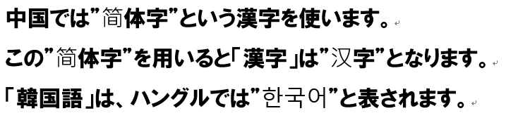
This is "Han Unification", a terrible idea from early in the development of Unicode. The idea was so bad that the affected glyphs are now also given always-Chinese and always-Japanese Unicode points, making it possible to, for example, compare a Chinese character to a Japanese character in the same document.
But the fix exists. You can specify that you have no idea what you're trying to write by coding it as U+76F4 (直). Or you can specify a Chinese character by coding U+FAA8 (直). Or you can specify a Japanese one by coding U+2F940 (直). There isn't actually a reason you'd want U+76F4 - it's just a dead, useless unicode point - but we can observe here that my default font doesn't include a glyph for either U+FAA8 or U+2F940 even though U+FAA8 is by definition identical to U+76FA (since this is a Chinese font).
The fact that it was the only one that properly rendered for me is an actual reason.
You don't want U+76F4, you want buggy Asian fonts to be fixed.
(On second thought... did it render correctly for you? Did you check?)
Yes there is: https://fonts.google.com/noto/specimen/Noto+Serif+JP
It sure has its style and I stand by what I've always maintained about gameplay being infinitely more important than polished graphics, but that does sound ironic to my ears!
Type layout in Japanese in particular has a system of layered, complex rules that include rules that define how to combine Western glyphs with Japanese glyphs and produce visually harmonic work. Swapping a font out due to a cost issue is not workable.
Also, not all pan-asian fonts contain all the glyphs you need to render all the characters you want. A CJK font has tens of thousands of characters, and it wouldn't surprise me if some of these video games will use fonts with particular glyphs that are not always included in other fonts.
Monotype is giving these customers the finger while also ramming a bulldozer in their asses with this change. It's completely unacceptable, painfully rude, and ridiculously tone deaf. In fairness, this is totally on brand for Monotype.
I am not sure if it's possible to parameterize it to have the look that game developers wanted.
I’ve been working on doing exactly that. Reconstructing clean vector glyphs from old metal-type Japanese books. The quality of those prints is surprisingly high, and they include thousands of kanji in consistent style. With some new technological innovations and a reasonable amount of hard work, you can produce a completely new, fully legal font family without touching any commercial IP.
The method I've devised is proprietary, but I’ll say this: it’s absolutely possible, and the output rivals modern JP fonts.
Given the sudden jump from ~$300/year to ~$20k/year for some devs, I expect more people to go down the “rebuild from PD artifacts” route instead of staying locked to a monopoly.
A few hours later, you have a font you can use how you like. Is it as good? Probably not, but it's much cheaper.
Edit: oh look https://news.ycombinator.com/item?id=46127400
This isn't like anything ever done before. It's entirely different and higher quality than any result you can get through AI or OCR.
I do agree that detailed work is required to do it correctly and produced high quality results. I'm not offhandedly saying "just do these simple things and bam perfection."
It's very cool, would love to see some fonts you have available whenever it's out!
The underlying new computational geometry method can be extended to 3d but that isn't necessary for this application unless we also extract a 3d image of the page itself. For now at least we are not doing that as it would be even more complicated and finicky. Possibly for soft enough pages the letterpress imprint will deform the page enough that the deformation can be detected and help figure out where the original metal pressed and where the ink is due to page bleed.
Essentially what we are doing is taking high resolution photos, using computational geometry methods on those to extract the shapes, and then refining those shapes through a mixture of automation and manual labor.
The entire thing is called "Donkey Free" and will have information online in the near future. I just bought the domain ( donkeyfree.com ) for this 2 days ago; this is all extremely new. I'd like to release the resulting fonts under a license allowing free use for many purposes but we still need to think through that to figure out how to make that sustainable.
How do you match up the scans with unicode entities? Human supervision and/or OCR? To what extent is the breadth and quality of OCR the limiting factor?
How do you define your target entity coverage?
1. Latin vs. CJK differences Latin glyphs are structurally simple: limited stroke vocabulary, mostly predictable modulation, and relatively low topological variation. Once you can recover outlines and stroke junctions accurately, mapping to Unicode is almost trivial.
That can be done with standard OCR methods for Latin.
CJK is the opposite. Each character is effectively a miniature blueprint with dozens of micro-decisions: stroke order, brush pressure artifacts, serif style, shape proportion, and even regional typographic conventions. Treating it like Latin “but bigger” doesn’t work. So the workflow for CJK has extra normalization steps and more constraints, especially when reconstructing consistent glyph families rather than one-offs.
From a simple perspective, CJK has many characters with disconnected pieces that are still part of the same character.
2. How we match scans to Unicode entities We don’t rely on conventional OCR at all. OCR engines are optimized for reading text, not recovering the underlying design intent. Our process is closer to forensic glyph analysis — reconstructing stable structural signatures, then mapping those signatures to references.
This ends up being a hybrid: • deterministic structural matching • limited supervised correction when ambiguity exists • and zero reliance on any off-the-shelf OCR models
It’s not “OCR first, match later.” It’s “reconstruct the letterpress structure, then Unicode becomes a lookup.” OCR quality literally doesn’t limit us because OCR isn’t part of the critical path.
3. What determines coverage Coverage is defined by what we can physically access and reconstruct cleanly. For Latin, coverage is straightforward. For CJK, coverage is shaped by: • typeface completeness in the source material • the consistency of impression depth • survivability of fine strokes in early printings • and the practical question of how many thousand characters the original font designer actually cut
There’s no need for the entire Unicode set per book. The historical font only ever covered a finite subset. It is unfortunate that every book doesn't use every glyph, but not catastrophic because we can source many public domain books from the same era and eventually find enough characters matching the style.
In short: Latin is an engineering challenge. CJK is an archaeological one. OCR is not a bottleneck because we don’t use it. Coverage follows the historical material, not Unicode completeness.
Edit: This paragraph was incorrect:
    The fonts affected apparently include ones like the main Japanese language
    font used by the game Genshin Impact, which has 2.8 million daily users
    worldwide (no idea of the Japanese user count specifically, but I'm sure
    it's over 25,000).
https://www.hanyi.com.cn/adminlte/ueditor/image/20230906/169...
Monotype has a Chinese subsidiary [0] which has worked with Chinese champions like Tencent [1] and Alibaba [2].
As long as a foreign vs Chinese business dispute doesn't involve a national champion or a very politically connected Chinese firm (or the foreign company made a partnership with a politically connected partner) the dispute is somewhat fair.
While China's leadership is trying to build self-sufficiency, it is also still trying to attract foreign companies to China and prevent an FDI outflow [3], and that requires some level of impartiality in contract disputes. China is not as economically isolated as Russia is today - though even Russian authorities tend to only use the heavy hammer against American and European companies as can be seen with the continued operation of Japanese, Korean, Taiwanese, Vietnamese, and Indian firms in Russia despite the risk of sanctions.
[0] - https://cn.monotype-asia.com/contact-us
[1] - https://www.monotype.com/resources/case-studies/tencent-expa...
[2] - https://www.monotype.com/resources/case-studies/alibaba-grou...
[3] - https://www.gov.cn/zhengce/zhengceku/202507/content_7032625....
Sounds like a typical private equity endeavor with short term thinking.
-- edit --
I'd add that companies always strive for more income. This is dead end. You cannot earn more without creating more. "Just add ai and convert to subscription" - this is current model. But, as Chris Rea sung, this ain't no technological breakdown, oh no, this is the road to hell
Many symbols are collections of other symbols raised and placed more or less on a grid. You could cover quite a lot with not that many created glyphs. Now, actually making it good quality and properly adjusted... that could take years...
They still have a healthy selection of competitive companies to choose from such as Morisawa, Iwata, Motoya, Ricoh, JIYUKOBO, DynaComware, Arphic, Sandoll...
Edit: though maybe grounds for a "rounded corners" style lawsuit, given the business style of the folk we are dealing with here.
Probably because you're wrong. Anybody can make a font, making a good font is a highly under appreciated art form.
Maybe the next major update will be able to do it.
It wasn't long ago that we thought creativity and programming were safe from AI. Fonts are entirely within the realm of possibilities within 12 months.
The price rising and licensing issue will only do one thing: pushing people to AI. Perhaps they see it as inevitable so they're trying to milk the last batch of customers though.
Even then, I wouldn't want it making a kanji font. Consider 感 and 惑, both of which would be taught before high school.
Also, generating images and programs are basically orthogonal. AI could generate impeccable photorealistic images of clocks years ago, and they're much more complex than font glyphs (specifically talking about transferring a style to other glyphs; you still need to do the initial design to get something appealing, obviously*).
*Edit: Maybe AI can even handle the initial design now, not sure. What I’m saying is AI-assisted style transfer in CJK fonts is definitely old news and commercially available.
Haiku 3.5 had a one right too. But k2 apparently is very good at html and css.
It would be pretty easy to make a font generator using LLMs and visual models.
Also how would you enforce the 25,000 user limit or is this just from a contractual perspective.